Design languageLiving Inkv1 · 2026
Living Ink.
A printed sheet that is alive. Warm paper, black ink, one vermilion mark, two typefaces — and dots placed on purpose. Everything on bcr.co is made of the same material as the portrait in the hero.
Paper, not screen.
The ground is warm paper, the text is ink, the rules are one pixel of ink. No gray chrome, no cards with shadows, no tinted panels.
Two typefaces.
Public Sans carries the voice; Courier carries the marks. Nothing else. The ink is the design.
One accent, one job.
Vermilion marks the live thing: the live dot, the current item, the one link to act on. It never fills a surface.
Dots are the material.
Photographs and ambient texture are halftone. Interface screenshots are plates — tipped in, shown true, captioned.
Motion is attention, not decoration.
Things respond to the pointer the way ink responds to pressure: locally, gently, and then they settle. Reduced motion turns it off and the page is still complete.
Marks, not chrome.
Metadata lives in the margins as typesetter's marks: index numbers, folios, crop marks, figure captions.
Ink 2 reads at 4.8:1 on paper and the accent at 4.7:1, so both can carry text. The 42% ink is for decorative marks only.
Modes
Signal is the dark counterpoint, used for one section (the experiments). Inside it the tokens are remapped, so every component adapts without new rules. Offset is misregistration: a touched headline slips its registration by two pixels, red one way and blue the other.
Human,
by design.
Let's chat.
The UI was killing the deal.
Design for the job, not the demo.
Let the record build itself.
I work with domain experts — analysts, quality engineers, lab scientists, IT administrators — from research through delivery.
The quality engineer needs to move fast under pressure. The compliance officer needs a complete record that may not be needed for months. These are in direct conflict. I solved it by designing documentation to happen as a byproduct of the workflow itself.
01 — Selected work · Fig. 02 · WireScreen — organization profile
Headlines are bold; statements are regular. The hero sets the rule: "Human, by design." is bold; the statements that open each section are not. Marks are uppercase and terse; prose is sentence case.
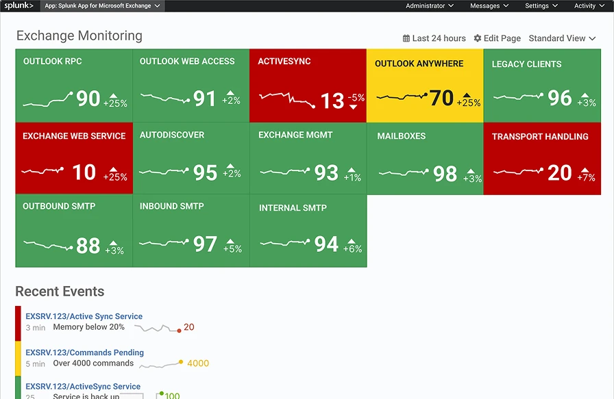
Plates are how screenshots enter the page: on plate paper, inside a hairline, with crop marks outside the corners and a figure number below. They are shown true, never tinted, never in a device bezel.
Ink under pressure: local, gentle, then it settles.
| Element | Behaviour | Numbers |
|---|---|---|
| Portrait | Gaze follows the pointer anywhere on the page; nearby dots displace. | 6 px displacement · reach 105 px · rests only when the pointer leaves the window |
| Living rule | Dots within reach of the pointer grow and darken, then settle. | spacing 9 · reach 140 · growth ×1.7 · falloff (1−t²)² · settle ×.18 per frame |
| Reveal | Blocks rise into place once, as they enter the viewport. | 10 px · 700 ms · cubic-bezier(.16, 1, .3, 1) |
| Offset | A touched headline slips its registration. | ±2 px · 160 ms |
| Wordmark | Starts as "bcr" with the accent dot at the end. A second after load it unfolds into "brian c reyes" and the dot slides onto the i as its tittle. Hovering folds it back; leaving unfolds it. | 900 ms · letters fade in over 600 ms |
| Neon Grid plate | The floor game runs live in its plate: targets light up, a player's shadow stomps them, the clock runs. The pointer lights the tile under it and can stomp a target too. | 32 × 18 tiles · a new target about every 1.5 s · 100 points a stomp |
| Reduced motion | Reveals, living rules and the Neon Grid are off; the plate shows its still. The portrait still answers the pointer, since it only moves when you do. | prefers-reduced-motion: reduce |
| Token | Desktop | ≤ 650 px | Note |
|---|---|---|---|
| Gutter | 34 px | 23 px | The hero's own margins |
| Section | 128 px | 88 px | Between numbered sections |
| Block | 64 px | 44 px | Inside a section |
| Grid | 12 columns · 24 px gap | 1 column | Two-column layouts collapse at 900 px |
| Measure | 62ch | Reading text never runs wider | |
| Container | none | The page is full bleed, like the sheet | |
The UI was killing the deal.
A comprehensive UX overhaul that elevated the platform experience.
Documentation time fell from about 40 minutes to about 10.
Dramatically streamlined the documentation process.
Fig. 02 · Dense, sortable tables replaced the card grid
Image of the new table design
The business problem first, the screen second. Numbers where they exist, no adjectives where they don't. The site speaks as Brian, in the first person — except the marks, which speak as the printer.
Same marks, same rules, inverted ink.
- A row in signalEverything remaps: ink, rules, plate paper, the accent.One section per page, at most